
When it comes to browsers, Chrome rocks of course. Boasting by far the largest market share of web browsers across various OSs and hardware platforms, Google proves yet again that they “get it.”
Among the reasons for Chrome’s popularity both with everyday users and developers are its ambitiously fast release cycle (roughly every six weeks) and constantly evolving feature set. However, for web developers and digital marketers, Chrome really shines with Chrome Developer Mode, the build-in web authoring and debugging tools accessed by hitting the F12 key.
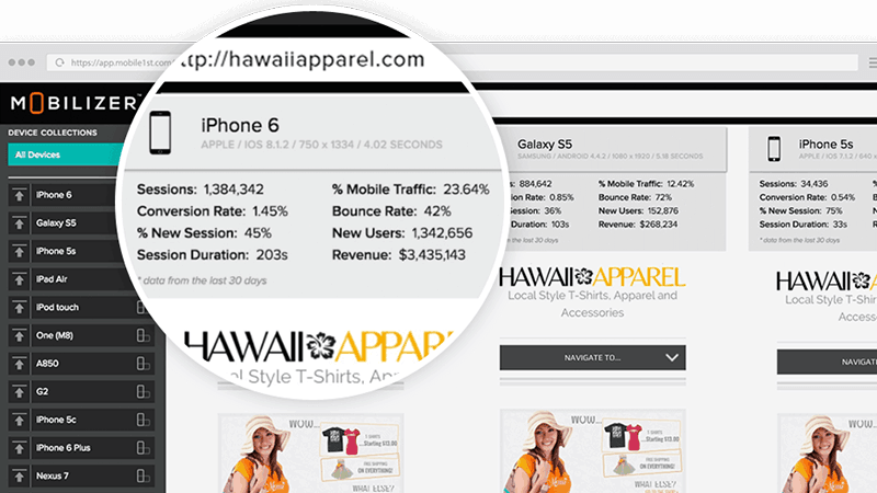
We’ve already talked about the convenience and benefits of Chrome Developer Tools (and their shortcomings) in this blog posting. Like a lot of great developer resources, when used in conjunction with other services, in this case Mobilizer’s online mobile testing lab, Chrome DevTools can really up your game and greatly improve productivity.
Chrome Developer Mode: Wise Up Your Mobile Workflow
Without question the developer tools native to Chrome are an invaluable resource and a must-use toolset for anyone building robust mobile websites designed to be fully compliant with Google’s browser. You’re probably familiar with the primary functions but here’s a brief overview.
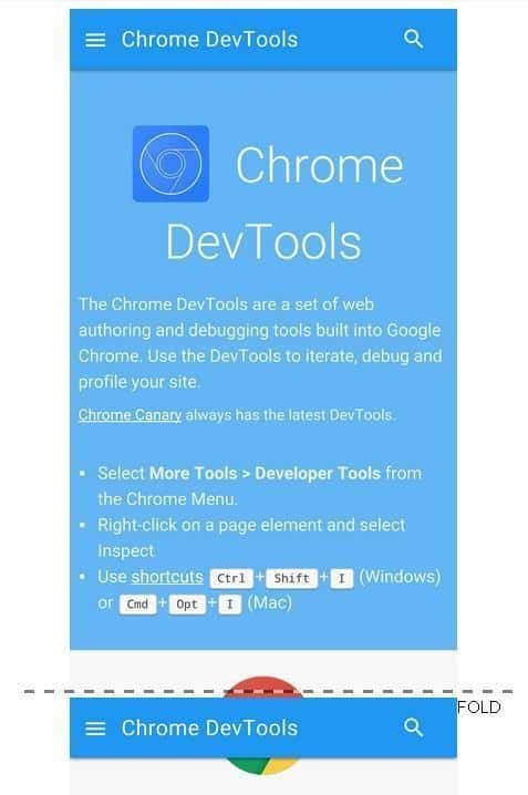
Chrome DevTools are comprised of 8 main groups of tools:
- Console: Provides code-level live view of a web page to review data, output, page elements, etc. Let’s you debug the page, view diagnostic messages, display both raw and structured data, control and filter output, examine and modify page elements, measure execution time, and more.
- Elements Panel: Document Object Model (DOM) view to inspect pages (HTML, CSS) and styles and live-edit them.
- Resources: Inspect and manage the local data resources (cookies, IndexedDB and Web SQL databases, application cache, storage) of your application, including the page resources (fonts, style sheets).
- Network Panel: Monitor and measure the network performance of your site.
- Sources Panel: Debugging and diagnostic toolset.
- Timeline: Review, record and identify activity in your application to uncover resource-draining problems or to simply improve performance.
- Profiles Panel: Inspect resource use (execution time/memory usage) with the CPU Profiler and heap Profiler.
- Audit Panel: A new (experimental) tool which provides an API to add new audit categories.
In addition to delivering a well thought-out range of editing, debugging and authoring tools, DevTools work together nicely to form an easy-to-learn integrated development environment. So far, so good. However, as you build out your new, world-shaking website you’ll want to see how beautifully it lights up all those iPhones, Galaxys and other leading phones and tablets. From purely a QA perspective, this is the point where Chrome Device Mode falls short and Mobilizer can seamlessly pick up the slack.
Get the Whole Picture on Every Mobile Device
The emulator provided within DevTools is called Device Mode. This feature is not particularly well promoted by Google (it’s not listed as one of the eight panels), nor is it as fleshed out or as elegant as the other tools.
Google even provides this caveat on the Device Mode descriptor page:
Device Mode does a whole lot to give you an experience as close as possible compared to the real deal, but keep in mind that you’ll still need to test on real devices to get the full picture (we can’t yet emulate the performance characteristics of a real device).
Designed to simulate display (but not performance) on a “wide range of devices”, Device Mode essentially attempts to enable developers to test responsiveness by enabling a series of Viewport Controls assigned to a comprehensive range of popular devices. Specifically, Device Mode has some limitations that we list here as a handy reference:
Device Hardware:
- GPU and CPU behaviour are not emulated
Browser UI:
- System displays, such as the address bar, are not emulated
- Native displays, such as <select> elements, are not emulated as a modal list.
- Some enhancements, such as number inputs opening a keypad, might vary from actual device behavior
Browser Functionality:
- WebGL operates in the emulator, but is not supported on iOS 7 devices
- MathML is not supported in Chrome, but is supported on iOS 7 devices
- The iOS 5 orientation zoom bug is not emulated
- The line-height CSS property operates in the emulator, but is not supported in Opera Mini
- CSS rule limits, such as those in Internet Explorer, are not emulated
AppCache:
- The emulator does not override the UA for AppCache manifest files or view source requests
Again, we detailed previously many of the reasons why the Chrome mobile emulator delivers inaccurate results. The root problems lie in its rendering and JavaScript engines and some very fundamental hardware and OS version issues:
- Chrome emulator’s output is entirely based on changing the screen resolution to match the dimensions of the device
- Device Mode uses different rendering engines than those actually used in Safari on iOS or the native Android browser
- The emulator uses a different JavaScript engine than Safari which uses JavaScriptCore/Nitro; Chrome uses V8
Collectively they virtually assure false, or at best, misleading test results. Of its multiple flaws, perhaps the most obvious is that the emulation provided by Device Mode is based entirely on changing the screen resolution to match the dimensions of the device. An imitation of anything is never as satisfactory as the real thing, of course, and this is no exception.
Galaxy 6S
iPad Air
Putting Google to the Test: Okay, we admit it – these guys are pretty sharp and we have serious campus envy over their whole Googleplex thing, but they could have cleaned up the responsiveness of their Chrome DevTools home page a tad, at least on the Galaxy 6S (top). We won’t even bring up the iPad Air (bottom.)
At Last: Fully Optimized Responsive Website Development
So, what’s a developer to do when the core functionality of simulating and testing mobile readiness in an otherwise great toolset is suspect? Experienced users of Mobilizer have discovered that when used in combination, the power of DevTools and accurate responsiveness testing on Mobilizer’s real devices can streamline workflow, improve accuracy of debugging procedures, and produce websites with superior resource management.
Here are some straightforward tips to get the best of both worlds:
- To gain a truly accurate measurement of render time, open your website (whether live or on a staging site) on Mobilizer in another Chrome browser to compare performance measurements provided by DevTools for discrepancies.
- Check the simulation being provided by the DevTools with Mobilizer to see the actual resolution on all popular devices to ensure pixel height and width, integrity of retina optimized images, and other display characteristics.
- After inspecting portrait and landscape orientation with DevTools, check real device screen orientation performance on Mobilizer.
- Knowing that the media query pixel breakpoints in DevTools can often provide unreliable results, load any pages with such content on Mobilizer to be certain.
- Close attention to analytics are essential to guarantee fast mobile load times, and only testing on real devices can provide measurements you can take to the bank.
- Not only is Chrome DevTools unable to provide uniformly accurate load times, Device Mode doesn’t even offer side-by-side device comparisons of multiple (14+) mobile devices. Mobilizer does, enabling quick identification of bugs in visual display.
- Once your site has gone live the need for tracking key performance metrics doesn’t go away – it becomes more important. While DevTools can help you manage resources during the development process, only Mobilizer offers automated alerts to notify you of variations in performance of your website on an ongoing basis. Key metrics include shifts in load time, bounce rate, and visit duration
Find out why Mobilizer was just named a “50 Must-Have Marketing Tool” and a “Top 5 Mobile Optimization Tool” by Docurated. Elevate your usage of Chrome DevTools with Mobilizer today to achieve mobile first performance perfection.

- Mobilizer Public Access Discontinued - January 8, 2019
- Improve Mobile Conversion Rates with Email Remarketing - December 12, 2018
- We Recommend: mCRO with Monetate Test and Segment™ - August 27, 2018