
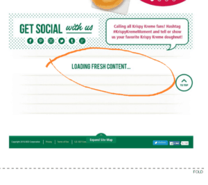
Everybody loves Krispy Kreme, the original glazed-all-over, melt in your mouth doughnut. But did you know Krispy Kreme has installed specially designed “tunnel ovens” in some locations to meet this particular “Hot Now” customer expectation? Unfortunately, tunnel vision is more like what consumer may see when they display the Krispy Kreme website on their iPad Mini or Galaxy Tab Pro. The big, colorful hero photos are cropped awkwardly, text is cut off, and below the fold content may fail to load on these mobile devices.
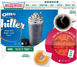
Holy cruller! The iced beverages are cool, but it’s not so cool when the name of the big promo is chopped off. And, please, load that fresh content already, my delicious Krispy Kreme coffee is getting cold!
Make Sure You’re Serving Up a Baker’s Dozen
When mobile marketing falls short, it’s problematic, but especially so in the quick serve industry. The coffee shop and casual restaurant sector is fiercely competitive and often relies on impulse buying. Consumers have many choices and typically rely on mobile devices to make a fast decision based on convenience and whatever enticing online offers they can view instantly. Any mobile website problems can turn off a customer faster than a stale Danish and a cold cup of Joe. Solid “mobile first” marketing requires flawless execution to earn their immediate business and long term loyalty.
But display issues on mobile devices don’t just provide a negative experience for visitors. They can impact your organic rankings. Google will often penalize websites with display issues because they measure when photos or text cannot be viewed correctly without zooming or scrolling. Take it from Google mobile which advises that the easy, efficient and cost-effective solution to achieve mobile friendliness is responsive web design (RWD). And the best way to make sure your website is mobile friendly across all popular devices is to compare display performance on actual hardware using Mobilizer.
When a crazy mad Krispy Kreme kraving strikes, who knows what device consumers will be using to find the nearest location – smartphone, tablet, desktop or laptop? Remember: visitors to your website simply want their information served fast and fresh – just like Krispy Kreme’s world famous doughnuts
- Google’s AMP: Enemy or Ally to Your Mobile Friendly Website? - January 29, 2018
- Mobile Marketing: Optimize the Mobile Customer Journey - January 29, 2018
- Mobile Load Time: Increasing Mobile Page Speed to Improve Mobile Conversion - January 22, 2018