Last Updated January 5, 2018
Here at Mobile1st, we are dedicated to the proposition that your business success increasingly depends on one simple, increasingly irrefutable, mathematically certain, undeniable truth: To succeed, your website better employ mobile-friendly web design.
What exactly is mobile-friendly web design?
At its simplest, mobile friendly design means your website’s information – images, texts, videos, links – is easily and readily accessible across all different platforms and, most particularly, on the much smaller screen of smartphones and tablets.
At a more complex level, mobile friendly means utilizing to the utmost all the incredible capabilities of mobile devices to deliver an effective, satisfying experience to users on the go.
Desktop vs. Phone & Tablet: The Big Difference
 When designing for the small screen, it’s important to recognize 3 elementary differences between the mobile experience and the desktop.
● Space is at a minimum.
● Attention is scarce.
● Mobile users are very goal directed, typically seeking a key piece of information that will facilitate their task.
Hence, the key guideline for mobile design is “simplify and specialize.” Each site should be streamlined with limited information and fewer functions compared to the full-fledged websites and multi-feature programs on the PC. Buttons, links, texts and pictures need to be resized to be functional and legible. Navigation through multiple subpages, too, should be kept to a bare minimum in your mobile design.
3 Ways to Make Enemies
Google increasingly demands that websites be super congenial with their mobile visitors. The search engine behemoth highlights three distinctly unfriendly defects to avoid when your site is rendered on the small screen.
● Text that is unreadable or pictures that are indecipherable without zooming or scrolling
● Tap-targets that inadequately spaced
● Unplayable content
And Google declares: the single “most easy, efficient and cost-effective solution to achieve mobile friendliness is responsive web design (RWD).”
Winning Friends with Responsive Web Design
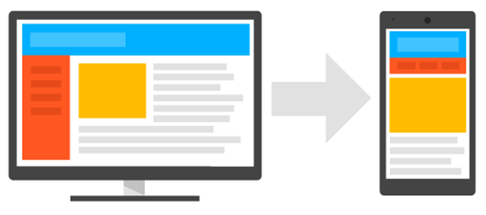
Now we are getting to the nitty-gritty of, not just what is friendly mobile design, but how to undertake that task. Responsive Website Design is an ingenious design technique that uses a single HTML code and a single URL for all platforms. Whether the consumer is browsing the web on a desktop PC or their preferred mobile device, the website will modify according to the screen size.
The trick of RWD is how it employs a fluid grid and flexible images. As a site identifies the smaller screen and altered proportions of the user’s device, it shifts to a more vertically stacked and simplified presentation. Visitors can now simply scroll down the site to experience all essential functions. Images, too, are set to readjust with shifting proportions and resolutions to ensure they fit the screen and are still understandable.
Better Play Nice!
Your shoppers, customers and business partners are none too picky about which device they are using, whether desktop, laptop, or mobile device. They just want their information served fast, fresh and convenient. And quite frequently, the most convenient device is the smartphone stashed in their purse or back pocket. So today, it’s a business necessity to deliver your website across all platforms while paying special attention to the mobile crowds. Take that as friendly advice, from one digital marketing pro to another.
- Google’s AMP: Enemy or Ally to Your Mobile Friendly Website? - January 29, 2018
- Mobile Marketing: Optimize the Mobile Customer Journey - January 29, 2018
- Mobile Load Time: Increasing Mobile Page Speed to Improve Mobile Conversion - January 22, 2018
