
Google and a coterie of content companies–including such luminaries as the Boston Globe and Reddit but also eBay–have embraced Accelerated Mobile Project (AMP). They declare it’s a solution to core user issues on the mobile web. But is it? Critics are howling, “No!” And how does AMP compare to responsive web design (RWD), the dominant approach to ensuring a mobile friendly website across all makes and models of smartphones?
The short answer is that AMP offers a good answer to one big problem—the irritating slowness of mobile delivery—but only for a subset of websites, most specifically publishers of fairly static content and in particular articles. But in many ways AMP detracts from achieving mobile perfection across a range of website functionality. Some even declare AMP is an enemy to mobile friendly websites.
RWD and AMP: Cool acronyms, but what are they?
AMP is … an open-source project headed by Google. It strives to achieve lighting fast delivery of content, especially for publishers, and it competes with the delivery of news and content by Facebook and Apples. It addresses the confounding issue of slow mobile page load times. After all, the starting point for every web visitor’s experience is how long they must wait while the page loads. Yes, first impressions matter, so it’s best to (quickly!) get off on the right foot.
“To date we have more than 600 million AMP documents in our index, with over 4 million new ones being added every week.”Google
AMP leverages best practices to build lightweight versions of web pages for superfast delivery. The project enforces a limited set of coding options to ensure reliable performance and accelerated loading. It employs a subset of HTML, but largely excludes JavaScript with its support for website interactivity. In addition, AMP relies on Google AMP Cache to store optimized elements of your website’s mobile pages at servers around the world, thus enabling faster delivery.
“Web design shouldn’t require countless custom-made solutions for each new category of users.”Smashing Magazine
RWD is … a single website that delivers premium functionality across a range of device sizes and capabilities. Whether the device is a desktop, tablet or phone, the website responds and adjusts images, text and functionality to ensure optimum legibility and interactivity. In practice, RWD consists of an array of flexible grid layouts and images that reconfigure to fit the visitor’s screen through the intelligent use of CSS media queries to ensure a mobile friendly website.
WHY AMP?
RWD is the industry standard for ensuring the vast, growing number of mobile users can access your mobile friendly website, but issues of slowness still plague the mobile web. Moreover, case studies demonstrate that lengthy mobile page load times are critical to a whole host of core business metrics:
- User satisfaction
- Conversion rates
- Search engine ranking
“Speed plays a critical role in e-commerce.”Senthil Padmanabhan, eBay Engineering Director
And AMP has been demonstrated to massively hasten load speeds and, in turn, these core business statistics. In fact, Google boasts, “The median time it takes for an AMP page to load from Google Search is less than one second.” Beyond this need for speed, AMP also saves on data delivery costs. AMP pages typically use 10 times less data than a comparable non-AMP page. Individual publishers have benchmarked key gains with AMP:
- When Slate adopted AMP, it saw a 44 percent jump in monthly unique visitors from Google searches.
- For Wired, the click-through rates (CTRs) on ads on AMP pages are 63 percent higher than on non-AMP pages.
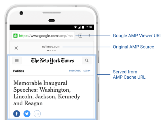
Image courtesy of Google
AMP vs RWD: Achieving a mobile friendly website:
AMP offers a stripped-down version of your mobile site. Yes, it’s built for speed but that rapid loading comes with a price tag. Because of its no-frills coding, the design of AMP pages may appear outdated—less elegant with reduced functionality. AMP doesn’t support the full functionality for websites that depend upon web forms and custom JavaScript technology.
AMP, some argue, is only a partial solution to the issue of ensuring a mobile-friendly website and delivering premium UX on mobile, and it violates the core philosophy of RWD: to create unified functionality and responsiveness that satisfies every website visitor no matter what their technology of choice. Moreover, web developers find AMP to be difficult to implement, noting that outside of WordPress, AMP is simply difficult to install, requiring a duplicate sets of pages.
In the end, AMP is a partial solution for a limited range of websites. But perhaps, like the NASA’s mission to the moon, AMP will generate innovative advances in the science of web delivery. Perhaps it will discover innovative answers to the perpetual conundrum of delivering a mobile friendly website to visitors arriving on an ever-evolving array of computing devices.
- Google’s AMP: Enemy or Ally to Your Mobile Friendly Website? - January 29, 2018
- Mobile Marketing: Optimize the Mobile Customer Journey - January 29, 2018
- Mobile Load Time: Increasing Mobile Page Speed to Improve Mobile Conversion - January 22, 2018