
For two years, digital agency Springbox has been hard at work redesigning the University of Texas at Austin website. As the sister company of Mobile 1st, the Springbox team got full access to the Mobilizer platform before its official release. With designers, developers and the QA team working in tandem, Mobilizer proved to be a powerful asset by:
- Speeding site redesign by ensuring fast, accurate responsive design testing
- Facilitating communication across key stakeholders including the designers, technical teams, and client owners
- Ensuring high-performance across the leading mobile devices through integrated KPIs
Wanted: An Optimal Mobile UX for UT
As 2016 begins its merry journey, Time Magazine reports the average American scans their phone 46 times a day, adding up to a mind-boggling 8 billion mobile check-ins. Whether compulsively observing the rise and fall of the stock index, text messages and weather reports or simply making sure the daily commute will be a smooth one, we are permanently tied to this bundle of infotainment. But for the younger generation of “millennials” those numbers spike sharply higher: 76 daily mobile interactions, or about once every 12 waking minutes.
No wonder University of Texas at Austin knew their website had to be manifestly “mobile first” if it was to truly serve the “Longhorn” student community and entice would-be freshmen. UT’s mobile strategy task force vowed:
Mobile-Friendly Development
With a front-end designer working alongside a back-end developer, most of the UT website was designed directly in-browser, and its responsive design was continually tested on both desktop and mobile. Using a mobile emulator to inspect changes on the fly, designers and developers turned to Mobilizer’s solution and its native testing capabilities to verify everything from breakpoints to wrapping up a day’s worth of work.
By identifying bugs across devices even before the QA process started, the development team could speed up the timeline of work to ensure proper delivery. Eliminating the need to physically test on devices, the developers were able to save time with online mobile testing while still ensuring 100% accuracy.
Checking It Twice
Traditionally, Springbox’s QA specialists confronted a welter of issues when working to ensure a glitch-free mobile UX. Mobile testing necessitated an in-house collection of phones and tablets, but frequent shifts in which devices were most current and most popular wasted the agency’s time and money. Furthermore, the QA team was forced to test the website serially, on one device after another.
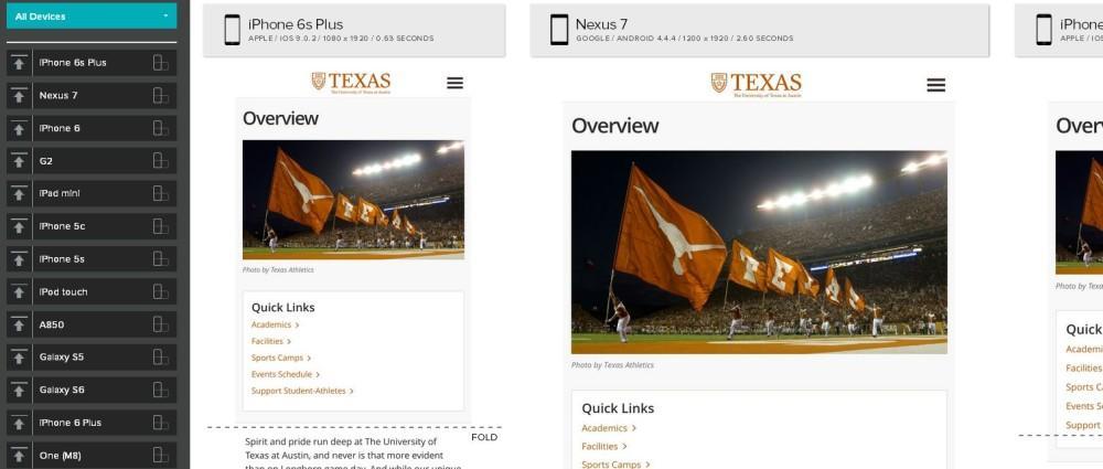
With Mobilizer, the QA team was able to accelerate testing. Within seconds of entering the URL, Mobilizer generated screenshots of the website on 15 leading phones and tablets. The screen captures could then be scrutinized for bugs, easily annotated and shared out with the whole team ‒ designers, developers and stakeholders ‒ to speed development and keep them apprised of progress. And by scrutinizing the mobile screenshots side-by-side across varying platforms, QA could identify which bugs appeared most often to prioritize problems and create efficiencies in the debugging process.
Demo Time!
Leading up to the final delivery to UT, the Engagement team at Springbox deployed Mobilizer to give their clients at UT an idea of what to expect. Additionally, Mobilizer was able to catch bugs on devices that were not included in the original scope of work, a huge benefit to an institution that caters to visitors across the globe. This created a better experience by giving the UT clients an understanding of what needed to be done by their internal technology team. Small deliverables like that build trust between Springbox and their clients, strengthening the chance of success when pitching for future work.
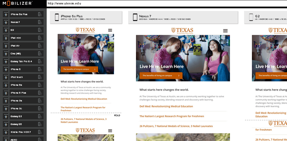
When it came time to officially rollout and demo the website, Mobilizer’s sharp precise screenshots of the new website across 17 phones and tablets – all in perfect glorious display – helped wow the UT committee of deans, faculty and tech staff. And Mobilizer’s built-in analytics showed how well the site met the agreed-upon performance levels, such as load time.
With Mobilizer, the Springbox team was able to take its UT website redesign to the next level – from the responsive design testing phase through deployment and post-production performance visibility. Whether testing across device platforms, driving optimization, monitoring ongoing performance or reporting mobile accomplishments to stakeholders and clients, Mobilizer and its Mobile Performance Platform (MPP) can be an integral component in every project’s lifecycle.
- Google’s AMP: Enemy or Ally to Your Mobile Friendly Website? - January 29, 2018
- Mobile Marketing: Optimize the Mobile Customer Journey - January 29, 2018
- Mobile Load Time: Increasing Mobile Page Speed to Improve Mobile Conversion - January 22, 2018