
A commitment to designing the best user experience (UX) for the masses of mobile users has initiated a sustained transformation in the principles of web design. Like a Zen experience, responsive web design and mobile optimization strip away what is inessential and hone in on what’s really necessary – all that which truly enhances the core user experience.
Why this single-minded focus on UX?
The mobile platform and its typical use cases imposes severe limits on website design. But necessity can often be mother of invention. In particular, three constraints of smartphones compel designers and developers to eliminate all that is inessential:
- Limited screen size. An average phone may possess a screen 1/20th the real estate of a desktop or even less.
- Network speed and performance limitations
- The goal-directed nature of mobile users, who typically seeking a key piece of information that will help them achieve their purpose. But at the same time, users are the go are often easily distracted and may well be multitasking.
Embracing these constraints, designers have crafted best practices that often turn a single-minded focus on utility into sheer user-friendly elegance. Here are eight transformative mobile optimization design tips that will help you deliver the best, intuitive, Zen-like mobile UX.
1. Pare Down Your Responsive Web Design (RWD) to the Essentials
The human species was not designed for smartphones. Our fingers are too stubby, our eyesight too limited, our cognitive capacities … well, I am sure you don’t need to be reminded about the frailty of the human mind. Let’s just say we are easily distracted and quickly frustrated by complexity.
The best, most elegant mobile sites, therefore, are pleasingly effortless. They deliver exactly the information the user needs in a clear, intuitive, easy-to-navigate format.
To streamline and mobile optimize your design:
- First determine what is essential to the user’s purpose and prioritize that content.
- Limit the content on your page. Display only the information and cues necessary for user to perform the page’s key task.
- Provide your prospects or customers with a clear path to crucial information and a transparent highlighted route to subsequent action.
- If your website has a complex content, let users navigate to additional layers of content. Include a search bar or buttons for easy navigation. Mobile visitors can always click through to access more detailed information on secondary pages.
- Ensure images communicate the page’s main point.
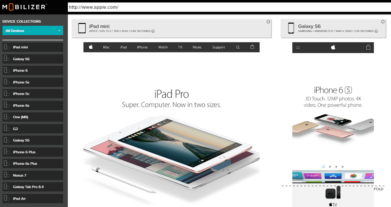
- Test with users! Testing with a diverse group of your target users is mandatory to ensure the design that you think is great actually is. And test across a range of mobile devices with an online mobile testing platform such as Mobilizer – See exactly how your website looks to mobile users.

Edward Jones drastically simplifies its website for mobile presentation.
The takeaway: When your website visitors can find the information they need and accomplish their desired action without confusion or hesitation, you have achieved the nirvana of mobile responsive design.
2. Ensure Your Print Is Large and Legible
Google immediately knocks off points in its organic rankings for text that is difficult to read. And legibility is one the five key metrics for Google’s test for mobile friendliness.
Your mobile design should pull in your visitors with easily legible fonts, avoiding any need to zoom in on the screen. Google recommends these guidelines for website fonts that provide a premium RWD mobile experience:
- Use a base font size of 16 CSS pixels. Adjust the size as needed based on properties of the font being used.
- Use sizes relative to the base size to define the typographic scale.
- Text needs vertical space between its characters and may need to be adjusted for each font. The general recommendation is to use the browser default line-height of 1.2em.
- Restrict the number of fonts used and the typographic scale: too many fonts and font sizes lead to messy and overly complex page layouts.
But what type of fonts? The choices are legion and, yes, battles rage over whether to use serif or san serif. It’s wise to avoid complex and overly stylized fonts. Then again, it’s the precise combination of fonts, both in size and typeface, that create a page’s visual hierarchy and guide the website visitor. In the end, it all comes down to your site’s purpose and user experience, says UserTesting.com.
The takeaway: The size and clarity of your type font is critical for UX and SEO. As you build your website, consult the extensive best practices developed by designers to ensure a mobile optimized website. And test your website on a variety of mobile devices to quickly see just how your users will see it.
3. Be Here, Now: Load Your Mobile Website in Three Seconds or Less
A major mobile user complaint and cause for falling conversion is sluggish load times on mobile. If you want to please your visitor, aim for a maximum three-second mobile load. Anything beyond three seconds and impatient Millennial customers start fidgeting and fleeing in unhappy frustration. Load time is also a big ranking signal for Google.
The low-hanging, heavy fruit when it comes to slicing seconds off load time is images and their heavy weight. To speed your page load, resize your pics for the web and compress them.
Reducing load time is critical and great attention has been devoted to this thorny issue from heavyweights like Google and on down.
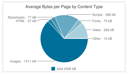
Chart courtesy of HTTP Archive
The takeaway: Load time is critical to both UX and mobile CRO (conversion rate optimization). Reduce your render time to 3 seconds.
4. Write What Is Necessary (and No More)
Most mobile visitors are in hot pursuit of their target. They hunt information to make a decision, locate their target destination and determine their next step. Despite the smartphone’s growing importance as a leisure-time tool, few smartphone owners – even among the 46% who swear they couldn’t live without their phone – are prepared to be absorbed in the meanderings of a long narrative and follow it through to its conclusion, no matter how affecting and insightful.
So write clearly, concisely, even crisply, and if you can, with pith and punch.
Ruthless editing is essential to preparing your web page. Delete all excess verbiage and redundancies. Make sure your prose is as sharp and to the point as a samurai’s sword.
Write in sound bites, and make headlines, taglines, bullets and CTAs fun and memorable, do so, but in any case make them short and to the point. As the haiku poet Basho remarked in 1682, “If you can’t say it in a mere 17 syllables, it’s not worth saying.”
Apple – long known for its crisp, sparse, elegant web design
The takeaway: Strive for lean, spare writing with all the fat sliced away. That’s how to achieve mobile optimization.
5. Pictures: The Image of Mobile Optimizations
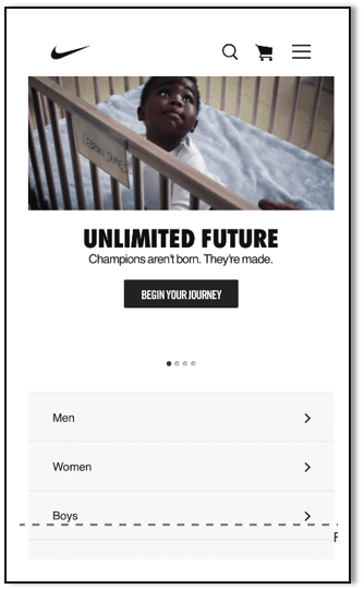
Nike demonstrates the story-telling power of even seemingly simple images with its picture of Lebron James as a baby.
The same ruthless focus on clarity and messaging that you apply to fonts, words, and so on, should also apply to images. Given the precious real estate of your mobile screen, use images sparingly and make sure they advance your point.
Images of course can powerfully and poignantly convey information. Moreover, eye-tracking studies reveal that images inevitably attract a mobile user’s attention, eclipsing mere words.
The takeaway: To optimize mobile, use images sparingly and only those that effectively communicate your message. Extra images rapidly add to your site’s footprint and page load times.
6. Understand the Beast: Align with Mobile Device Conventions
A critical step in successfully designing your website is understanding the mobile platform and aligning with its conventions. Designers in conjunction with phone and tablet users have developed an entire lexicon of gestures and interactions to navigate through mobile websites and apps. These conventions typically exploit the strengths while avoiding the weaknesses inherent in the phone software and hardware.
Phone users habitually know how to scroll, navigate back to home page, and direct their eyeballs to typical locations for critical information, and more. Your RWD websites must take advantage of those elaborated shortcuts and power conventions and certainly not fight them by implementing novel, non-intuitive forms of interaction.
The takeaway: Build upon (and don’t battle) your users’ intuitive knowledge of the conventions of your platform.
7. Make Interface Actions Effortless
Offer buttons and icons to give your customer fast, easy and clear action choices. Exploit the power of your mobile platform to offer remarkable, relevant next-step options, including:
● Online support or sales chat
● Maps
● Social share links to social media such as Twitter, Facebook and LinkedIn
● Launch a video
● Click to call
● Visit a related website
● Move an item to shopping cart
● One-stop checkout
Remember, a critical element of Google’s mobile friendly test is that clickable elements, such as buttons, be a reasonable size with adequate space between elements to permit easy navigation by tapping with your finger.

HealthWatch 360 puts buttons front & center in its mobile display and its broader website to make its desired action super easy.
The takeaway: To achieve optimal UX and mobile CRO, use buttons to speed and guide user choices, make interactions effortless and delightful.
8. Orient Content to Visitor Needs
Is the content you serve up on your website delivering a satisfactory user experience? One critical measure of your visitor’s UX is your website’s bounce rate. This mobile metric reveals whether your website’s content is meeting user needs and expectations or are they making a quick departure after visiting their initial landing page. Ideally, your website leads the mobile user from one page of useful content to the next until they finally convert through a CTA.
A high bounce rate may:
- Lower your search ranking in Google
- Indicate you are attracting the wrong type of visitors and possibly spending resources and advertising in the wrong places
- Reveal you are not delivering a great UX to visitors, not guiding them from one segment of useful content to the next
To remedy a high bounce rate and a misalignment between your visitors and your website’s content, examine in detail your visitors’ interaction with your web pages, the nature of your traffic, and why those visitors are arriving at your website. Segmenting your traffic can help you identify who is finding your page content to be useful and who doesn’t.
The takeaway: Metrics, like bounce rate and visit duration, can be a powerful indicator of deficiencies in user experience.
Mobile design best practices in conjunction with a ruthless emphasis on user experience and repeated UX testing can ensure your website visitors find exactly what they are looking for with ease and elegance, while elevating your conversion rates and building enduring brand loyalty.

- Mobilizer Public Access Discontinued - January 8, 2019
- Improve Mobile Conversion Rates with Email Remarketing - December 12, 2018
- We Recommend: mCRO with Monetate Test and Segment™ - August 27, 2018