
Last Updated June 28, 2016
Look up to the screen…it’s a bird…it’s a plane…no, it’s a succinct and detailed representation of how your website displays on mobile!
A super critical but often overlooked element in any Mobile Performance Platform is the deceptively simple and humble mobile screenshot. Kind of like the caped crusader himself, a responsive mobile screenshot can swoop in and protect your team from miscommunication, wasted time, and loss of oversight. Amidst the confusion and just plain babble of working with a complex team, a picture can be worth a 1001 words. Like x-ray vision, a responsive screenshot can powerfully slice right through confusion to immediately expose the issue under review.
In fact, responsive screenshots of your website can play a critical role throughout the entire agile firm: speeding the collaboration of designers, UX and web coders, perfecting the work of QA, enabling review by stakeholders, and empowering strategic oversight by key stakeholders, CMOs and VPs.
Here are 4 ways the humble screenshot, much like mild-mannered Clark Kent, is powering forth to save mobile marketing, if not the entire planet.
4 Ways Responsive Screenshots Improve Mobile Marketing
1. Enable Agile Development on Mobile
In the collaboration among marketing teams – not just website developers, designers and UX and QA but also team leadership – nothing is more essential than mobile screenshots.
Screenshots render visible and shareable – even to geographically dispersed teams – what otherwise might be difficult to perceive, much less communicate out and explain.
Screenshots encompass five critical processes:
- Capturing your website’s visual performance on mobile before launch
- Reviewing and inspecting up-close and in detail your web pages
- Annotating captured images and sharing critical info among teams
- Communicating out the status of projects and accomplishments
- Enabling easy oversight by CMOs and other top marketing executives
If your teams can’t accomplish those necessary steps ‒ easily, quickly and effectively ‒ then your agile efforts to stay ahead of the market have met their kryptonite. Precious time is wasted while confusion weakens your team, and mistakes abound.
2. Responsive Screenshots: Make Visible the Invisible
 The first critical step is just gaining visibility into your website’s mobile performance and capturing it with screenshots. While seemingly easy, this first step is perhaps the most difficult and more fraught with dangers than…, well, than a warsuit in the hands of Lex Luthor.
The unpleasant truth today is that the universe of mobile devices is expanding and fragmenting at almost superhuman speed. With over 20,000 distinct versions of phones and tablets out there, gaining insight into your website’s performance on mobile is akin to jumping tall buildings in a single bound.
Fortunately, a variety of tools, including online mobile device labs, enable enterprises to capture their website’s display on an array of phones and tablets. But beware: introducing a tech tool between your team and actual mobile devices also raises issues of accuracy. Only screen grabs from real mobile devices ensures 100% accuracy.
In my experience, desirable features of this responsive screenshot should include:
- Confidence in 100% accuracy
- Side-by-side visual display of the website on a range multitude of phones and tablets
- The complete web page so you can scroll its entire length without interruption
- Precise detail and high-level imaging for up-close viewing
- Easy, intuitive user interface
- Integrated analytics so that marketing leaders can readily assess mobile performance as they review the visual displays
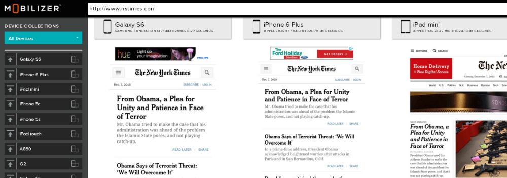
What features would be essential for your team? Scroll through this screenshot of The New York Times website and consider what’s critical and what’s not.
3. Drive Collaboration among Design, Web Dev and QA
Web Dev, QA and Design teams necessarily engage in close collaboration, but they often possess sharply distinct modes for perceiving and describing what’s working and what’s not on a website. They need a common comprehensible language, a common ground on which to coordinate their work. That shared language is supplied by the visual clarity of a screenshot.
Take, for example, the typical back-and-forth collaboration of Design and Web Development teams in refreshing a website with a new brand look. Here’s the inside view of Jeff Nagy, former Senior Project Manager at Citrix and currently Director of Operations at Two22:
4. Break Down Silos, Ensure Visibility and Enable Oversight
Mobile, like supervillian General Zod, offers a perilous challenge to the enterprise and its ability to identify issues and deliver optimized performance. Mobile as an inevitable touchpoint in the customer journey adds a heavy burden of complexity to the operations of the enterprise. Quickly viewable and shareable screen grabs ensure visibility ‒ from on-the-ground website creators to the higher masters of marketing strategy.
 Once a website has been updated and is ready to launch, the team needs to share the results with stakeholders. Responsive screenshots are critical to the effective reporting of mobile updates and performance to key audiences and marketing leadership.
Meanwhile marketing officers need easy visibility into the enterprise’s publicly displayed face on mobile. Marketing must stay on top of its mobile performance and ensure nothing tarnishes the brand’s reputation or lowers conversion rates. Here the modest screenshot tool enables mobile monitoring, but only if comes in a simple, intuitive interface so that all can quickly master its functionality. When integrated with mobile analytics, easily accessible screenshots offer an essential tool for insight and oversight.
The seemingly humble and mundane screenshot turns out to be a superhero for the enterprise. Easy access and communication of the company’s mobile performance helps marketing trounce such villains as silos, communication breakdowns, invisibility and excess complexity. Have no fear, the responsive screenshot is here!
- Google’s AMP: Enemy or Ally to Your Mobile Friendly Website? - January 29, 2018
- Mobile Marketing: Optimize the Mobile Customer Journey - January 29, 2018
- Mobile Load Time: Increasing Mobile Page Speed to Improve Mobile Conversion - January 22, 2018