
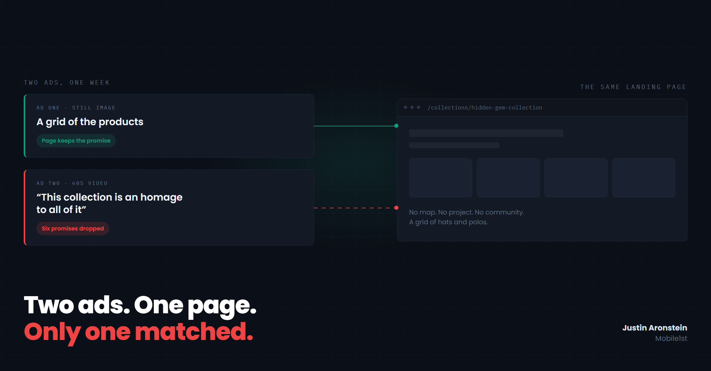
A golf-apparel brand we work with dropped a collection this summer. Two ads went out for it in the same week, both pointing at the same collection page.
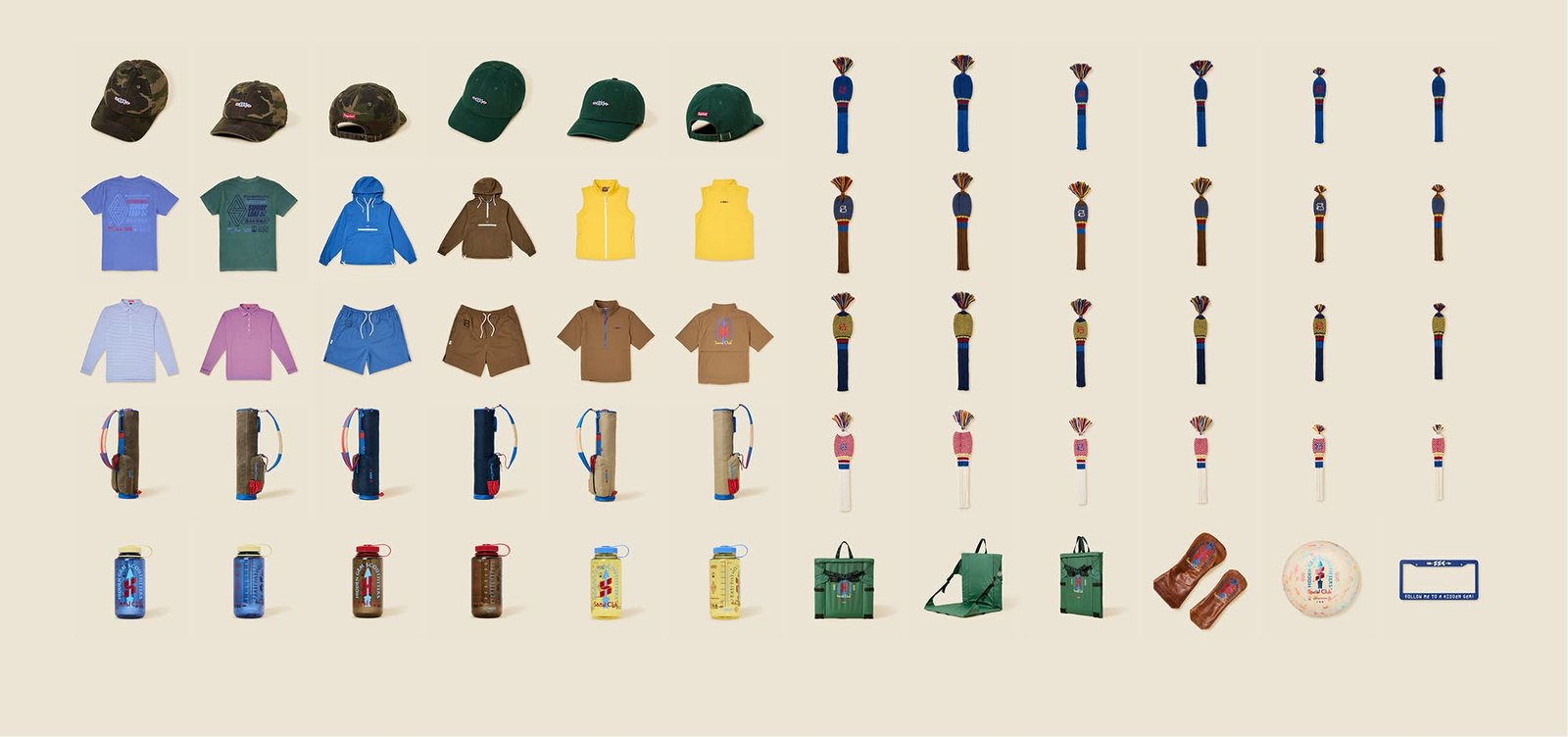
The first is a still image: a clean product grid on a cream background. Hats, polos, anoraks, headcovers, a couple of bags, a Nalgene. The caption reads: "It's just a collection that brings us a lot of joy. We've worked really hard on this for a long time. And now it's time to share it with you all."
Click it and you land on a collection page: a grid of hats, polos, anoraks, headcovers, bags. The ad is a grid of the products. The page is a grid of the products. Whatever that ad promised, the page delivers it about a second after the click.
The second ad is a minute of video, and one of the founders narrates it.
Ad one · the product grid
Ad two · the founder's video
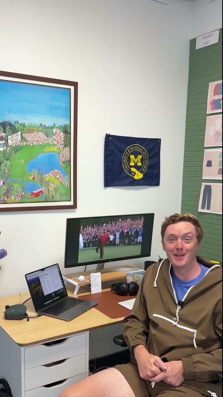
Same collection, same week, same landing page. One of these is about products. The other is about a decade-old community project.
Here's what he says:
More than a decade ago, we started the Hidden Gem project. We made a map of all of our favorites. Affordable, accessible, interesting golf courses. Bonus points if there's a good sandwich shop nearby. You guys have even submitted your favorites, and we added them to the map over the years. It's one of my favorite parts about the community we have here.
Then, at the turn:
And this collection is an homage to all of it. Colorways that remind us of an adventure to find a secret golf course.
On screen while he talks: the map itself.
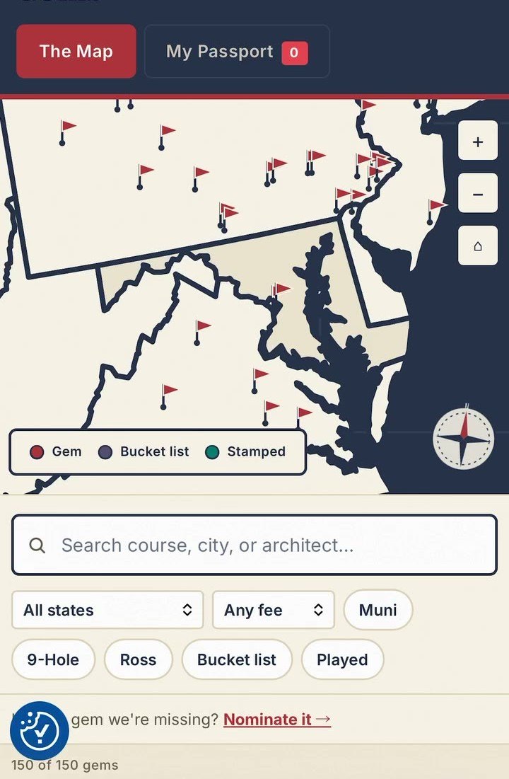
A search box for course, city, or architect. Filters for muni, 9-hole, any fee. A counter reading 150 gems, and a prompt to nominate one that's missing.
Click that ad and you land on the same collection page. The grid of hats and polos.
The page didn't get worse between the two clicks
Nobody redesigned anything. The same page, the same week, the same collection, and it is completely right for one ad and completely wrong for the other.
The grid ad promises here is a collection of stuff. The page is a collection of stuff. Nothing to fix.
The video promises something else entirely. A decade-old community project. A map of 150 courses that real people submitted. An aesthetic built around hunting down places nobody has heard of. It says, explicitly, that the clothes are an homage to that. Someone who watches all sixty seconds and clicks is not arriving to browse outerwear. They're arriving because they got told a story and want to be part of it.
Against the hierarchy, here is what he promised and what the page said back:
| Rung | What the ad promised | What the page said |
|---|---|---|
| 1 · promise | "This collection is an homage to all of it" | The project is never mentioned |
| 3 · claim | "We made a map of all of our favorites" | No map, no link to one |
| 3 · claim | "150 gems, you guys submitted your favorites" | No count, no community, no nomination |
| 4 · audience | "Affordable, accessible, interesting golf courses" | Nothing addressed to that shopper |
| 5 · voice | "Bonus points if there's a good sandwich shop nearby" | Nothing on the page sounds like him |
| 5 · proof | "More than a decade ago…" | No history, no reason to believe it |
So mismatch isn't a property of a page. It's a property of the pair. Audit your landing pages in isolation and this is invisible by construction, because there is nothing wrong with the page.
What we changed
For the video ad's traffic only, and for nobody else's:
The hero stops being a tall photo and starts naming the thing he named: colorways that remind us of an adventure to find a secret golf course. The products come up almost immediately, because someone who watched a minute of video doesn't need another minute of preamble.
Inside the grid, a strip inventories the kit the way he inventoried it out loud: anoraks with matching shorts, vests, windshirts, leather and knit headcovers, the bags, the Nalgenes.
Below the products, the parts of his story the page was missing: where the project came from, the map, the community that filled it in, and his sign-off.
The copy is his. It's lifted from what he actually says, not written fresh in a brand voice. He already made the promise in language his customers responded to well enough to click; there's no version we'd invent that beats it.
Someone arriving from the grid ad sees none of this. They get the page as it was, which was already right for them.
What happened
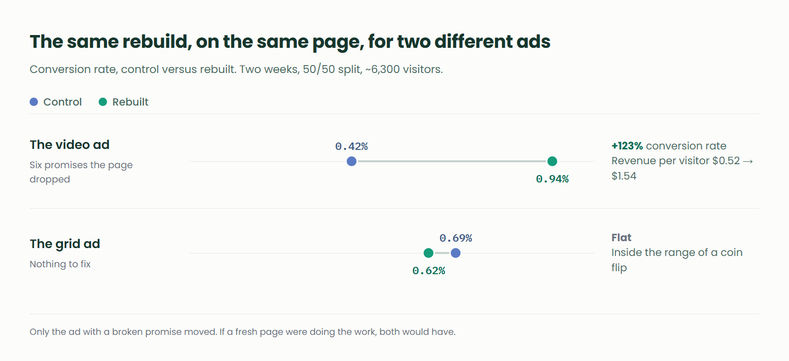
Both ads ran as 50/50 split tests against the same collection page. Two weeks, about 6,300 visitors between them.
The video ad, the one with the gaps:
| Control | Rebuilt | |
|---|---|---|
| Visitors | 1,431 | 1,390 |
| Conversion rate | 0.42% | 0.94% |
| Revenue per visitor | $0.52 | $1.54 |
Conversion rate up 123%. Revenue per visitor up 197%.
The grid ad, the one that already matched:
| Control | Rebuilt | |
|---|---|---|
| Visitors | 1,742 | 1,770 |
| Conversion rate | 0.69% | 0.62% |
| Revenue per visitor | $0.91 | $0.88 |
Flat. Slightly down, inside the range you'd expect from a coin flip.
The flat one is the interesting one
If we had only run the video ad's test, the honest read would be "a fresh page lifted conversion," and you'd be right to shrug. New pages lift conversion all the time. People click on things that look different. That effect is real, it's temporary, and the industry has been selling it as a win for twenty years.
But the same rebuild engine ran on the same page for the grid ad's traffic, in the same two weeks, with the same brand and the same products. And it did nothing.
That's the whole argument. If novelty were doing the work, both would have moved. If "our AI writes better pages than yours" were doing the work, both would have moved. Only the one with something to fix moved, which means what moved it was closing the gap between what the ad promised and what the page said.
The grid ad never had a gap. There was nothing there to close.
Try it on five ads this week
Take your five highest-spend ads. For each one, open the ad and the landing page side by side.
Watch the ad all the way through with the sound on and write down every promise it makes, spoken or on screen or in the caption. Not the theme. The specific claims. A map of 150 courses. The community submitted them. More than a decade old.
Then read the page and check them off.
The ones you can't check off are the gaps. Most of the time you'll find the page keeps the caption's promise and drops everything the video said, which tracks: the caption is the part someone wrote in the same tool that made the landing page.
Do that five times and you'll know whether this is a problem in your account. It took us longer to explain than it'll take you to run.
Doing it by hand works. It stops working around ad six. Every ad checked against the page it points at, re-checked as new creative ships, is the job we built Throughline to do, for email campaigns and the pages their links land on as much as for ads. Everything ships as a split test, and nothing serves until you approve it.