
We call the distance between what an ad promises and what its landing page delivers the message-match gap. To see how much it actually costs brands, we analyzed the Meta advertising of 22 leading DTC brands: reading what each ad promises (the words baked into the creative, the words spoken in the video) and checking, piece by piece, whether the destination page delivers it.
This isn't a vibe check. Every ad-to-page pair gets broken into the specific promises the ad makes: the primary promise, the offer, specific claims, audience signals, tone, urgency, and social proof. A page either carries each one or it doesn't. A promise the page drops is a gap.
Then we ranked all 22 brands by how many gaps they rack up per ad. The distance between the top and the bottom isn't subtle.
The Best: Quince (1.6 Gaps Per Ad)
Promise kept
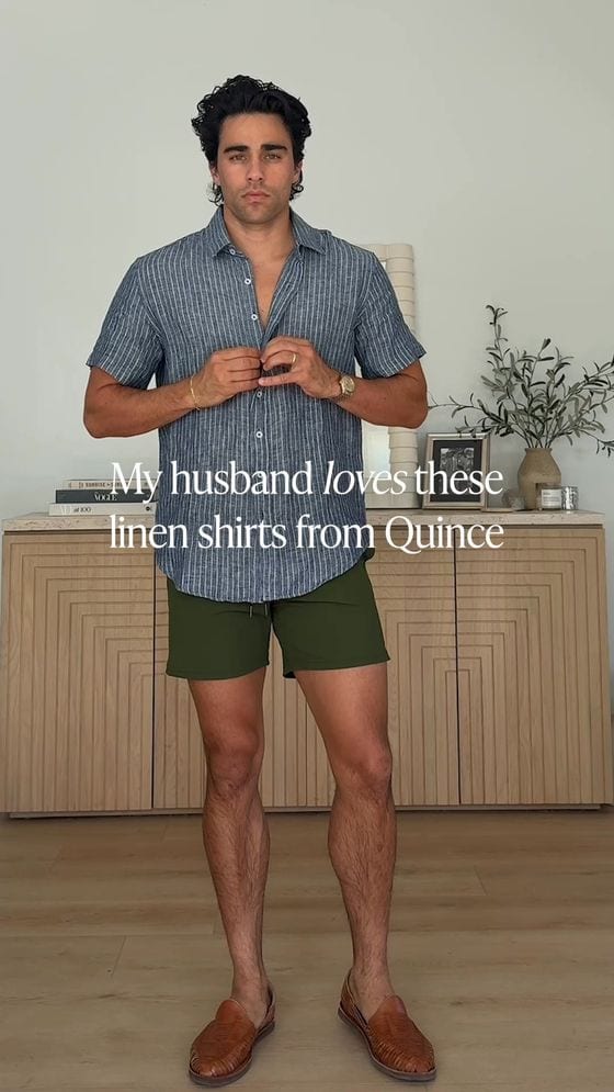
The ad
The page it links to
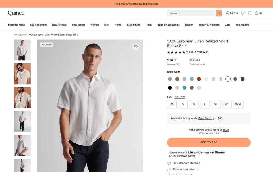
The exact shirt from the ad, $34 (down from $98, "you save 65%"), 3,056 reviews and a "Best seller" flag, all settled above the fold.
Quince runs a warm, word-of-mouth style ad: "My husband loves these linen shirts from Quince." Click it, and you land on the exact product being talked about, the 100% European Linen Relaxed Short Sleeve Shirt, with the whole promise settled before you scroll:
- The exact shirt from the ad, front and center.
- $34, marked down from $98 ("you save 65%") right next to the price.
- 3,056 reviews, a "Best seller" flag, free shipping, and 365-day returns, all above the fold.
The ad made a promise. The page paid it off, in full, instantly. Across all five of Quince's ads, we found 8 gaps total, 1.6 per ad, and every one of them was cosmetic: a missing trust badge here, a slightly under-specified audience cue there. Quince never drops the promise, never drops the offer, never leaves a visitor wondering if they're in the right place.
Bombas ties Quince for the fewest gaps in the entire index (also 1.6 per ad). The pattern at the top is consistent: the core message always survives the click.
The Worst: Fabletics (6.6 Gaps Per Ad)
Promise lost
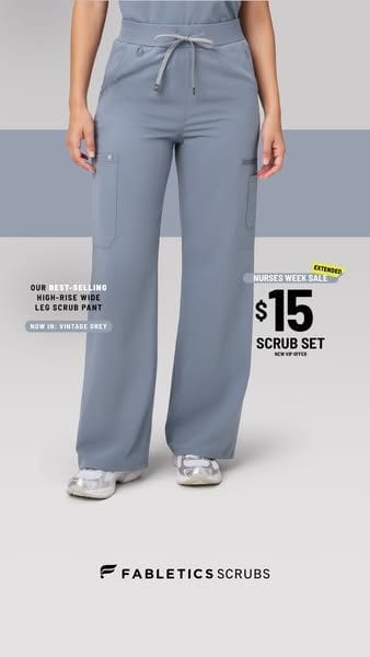
The ad
The page you actually get
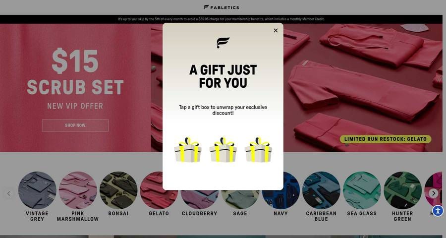
A specific ad about one color for summer leads to a generic "join VIP" page, with a "tap a gift box" pop-up sitting on top of the hero.
Fabletics runs a genuinely good, specific ad:
"Introducing Vintage Grey, your new go-with-everything scrubs color this summer! For a limited time, get your first scrub set for just $15 as a new VIP signup."
A color. A season. A versatility angle. A price. Click it, and you don't land on Vintage Grey. You land on a generic "join VIP" membership page, greeted by a gamified pop-up ("A gift just for you, tap a gift box to unwrap your discount") sitting on top of the hero. Vintage Grey survives as one swatch in a row of ten. The "go-with-everything" pitch, the summer story, the specific reason you clicked: gone. The ad sold a product. The page sells a subscription.
That's the pattern for every Fabletics ad we looked at: a sharp, specific hook poured into the same one-size-fits-all funnel. Across their five ads we counted 33 gaps, 6.6 per ad, roughly four times Quince's rate. And these aren't cosmetic. Six or seven of every ad's eight promises were gaps.
The Pattern Holds Across the Index
Zoom out from the two extremes and the difference between the best and worst halves is structural, not random:
- The best brands never drop the load-bearing pieces. Across the six lowest-gap brands, we found zero dropped offers and only a handful of weak primary-promise or tone components. Their misses are refinements.
- The worst brands drop exactly those pieces. Across the six highest-gap brands, the most common gaps were the primary promise, the tone and identity of the brand, and the offer itself: the things a visitor needs to see in the first two seconds to believe they're in the right place.
Message match isn't a tie-breaker that separates good stores from great ones. It's the difference between a page that confirms the click and a page that silently asks the visitor to start over.
Closing the Gap: A Live Client
Knowing where the gaps are is one problem. Closing them, across every ad, every week, without rebuilding your site, is the harder one. That's what Throughline does. Here's one live client, a DTC apparel brand.
We ran the client's Meta ads through the same diagnosis, then generated a matched landing-page variant for each one. Across 37 rebuilds, Throughline diagnosed and closed the majority of the gaps standing between the brand's ads and its pages:
How It Closes a Gap: One Real Example
The client ran a Father's Day ad: your dad wants a new polo, plus the gear from their latest sneaker-brand collab. The collection page it linked to led with a generic "the new drop is now live, shop now" banner. None of the gifting occasion. None of the collab. Five gaps, one for each promise the ad made and the page ignored.
Throughline's fix didn't invent new marketing copy. It borrowed the ad's own words back onto the page, the principle the whole engine runs on:
- Primary promise: a hero subhead delivering the Father's Day gifting line the ad opened with, above the fold.
- Urgency: the announcement bar rewritten from "now live" to the time-sensitive Father's Day occasion the ad established.
- Audience and tone: a short intro reinstating the gift-buyer framing and the brand's playful voice.
- Specific claim: a callout naming the exact sneaker collaboration the ad led with.
Four of the five gaps closed. Same products, same brand, same page. Now it finishes the sentence the ad started.
The Early Results
Every one of these variants runs as a true A/B test against the original page, so the lift is measured, not asserted. In the first weeks of live testing on Meta, the rebuilt pages are running ahead of the originals: a variant conversion rate of roughly 4.3% versus 3.1% on the control, +38% relative.
The honest caveat matters. That's an early, directional signal built on about two dozen conversions. It's not yet statistically significant, and on a sample this small the number will move as more traffic accumulates. We're reporting the direction, not planting a flag. But it's the direction you'd expect when the page finally says what the ad promised.
The Takeaway
The best DTC stores and the worst aren't separated by better creative or bigger budgets. They're separated by whether the promise survives the click. Quince's pages finish every sentence its ads start. Fabletics' pages make you start over.
Closing that gap doesn't require a redesign or a new copywriter. It requires reading what your ad actually promised and making sure the page delivers it. That's a measurable number. Most brands have never looked at it.
See where your own ads and pages don't match. Run the free demo. →
Justin Aronstein is Chief Product Officer at Mobile1st, where he helps e-commerce brands grow revenue per visitor through experimentation and ad-to-page personalization. He also co-hosts Checkin to Checkout, a podcast for e-commerce operators who'd rather build than babysit dashboards.