
Stop Building Online Vending Machines
Almost every e-commerce sites doing between $10M and $100M are basically just high-resolution vending machines.
You know the look. You land on the site and it’s just rows of product cards. Dresses, pants, accessories, repeat. It’s efficient, sure. But it’s sterile.
Then, usually buried somewhere in the footer, there’s a link to an "About Us" page or a blog that talks about the brand’s "lifestyle" and "mission." The “About Us” page, might event talk about charities the company supports.
Unfortunately, though Less than 5% of your traffic ever gets to the About Us page.
If your brand story lives in the footer, it doesn't exist. You’re running a catalog, not a community. And in 2026, catalogs get crushed by Amazon.
The Great "Friction" Lie
I’m going to say something that might get me kicked out of the CRO club: Friction is rarely your problem.
We’ve run thousands of experiments, and the ones focused solely on "reducing friction" lose about 90% of the time.
Your customers aren't stupid. They know how to checkout. The reason they aren't buying isn't because they can't find the button; it’s because they don't care yet. They want to know if the product solves their specific problem ("Is this teacher-appropriate?") and if they trust the brand.
You answer those questions with context, not by shaving 0.2 seconds off your load time.
From Catalog to Cult: The "Outdoor Voices" Effect
Remember early Outdoor Voices? They didn't just sell leggings; they sold the "Doing Things" club.
They hosted runs, took photos of real people, and splashed those gritty, sweaty, happy photos all over the site. When you bought the hat, you weren't buying a hat, you were buying entry into the in-crew. You saw those hats everywhere and you felt part of something.
You don't need a VC budget to do this. You just need to stop hiding your community in the blog and start putting it where the money is.
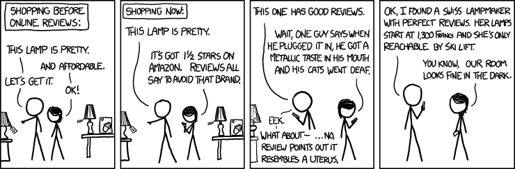
Credit: xkcd.
How to Kill the Vending Machine (Without a Redesign)
You don't need a massive re-platform to fix this. You need to change how you talk, where you put your content, and how your team meets on Mondays.
1. The "First Order" Copywriting Rule
Go read your top-selling Product Detail Page (PDP). Does it sound like a corporate slog written by an SEO agency? "This garment features a poly-blend conducive to..."
Boring.
Rewrite it in the Founder’s Voice. Go back to how you sold the product when you got your very first order. Why did she design this? Did she find the pattern in a vintage market? How does she wear it? When you swap "product specs" for "founder stories," you stop selling a commodity and start selling a connection.
2. The "Below the Fold" Lifestyle Layer
There is a fear that adding "community" content will distract from the Buy Button. That’s nonsense.
Keep the top of the page clean for the transaction, but as they start scrolling, that is your invitation to show them how the product fits their life.
Don't just show the dress. Show the "Teacher's Edit." Show the UGC photos of real customers wearing it in the classroom or at Sunday service. Prove to them that this product belongs in their specific world.
3. Merchandise by Lifestyle
Yes, it’s important to be able to shop by dresses, pants, skirts and shirts… But that’s not the only way people shop. They also think, where will I be wearing this outfit? Or what will I be doing?
You can merchandise in the navigation, on the home-page and even on the PDP by where will this skirt be worn? For Teachers, or Best for Church, or even Moms’ Favorites.
When you merchandise this way, shoppers start to see themselves in these groups and think okay, this will solve my problem. Make these lifestyles front and center as people browse.
4. Search means your Merchandising is Broken
This is a hard pill to swallow, but if a user has to use your Search bar or even your Hamburger menu, you have failed them.
Think about mobile. The navigation is hidden behind an icon. If a user has to tap that icon to find what they want, it means the page they were just on, the PDP, didn't give them a clear path to browse.
Your PDP should be a browsing engine. If they are looking at a floral dress, don't make them search for "more floral." Guide them effortlessly to the "Floral Shop" or the "Maxi Collection" directly from the content they are already consuming.
5. Pivot the "Dreaded" Weekly Meeting
Every Monday, your team probably sits in a room (or a Zoom) and reads a spreadsheet of numbers out loud. Everyone hates this meeting.
Keep the meeting, but change the agenda. Instead of just reporting what happened, share why it happened.
Your Social Team knows that a specific video of a mom packing a lunchbox went viral. Your Ad team knows that "Teacher" messaging is outperforming "Sale" messaging. Those assets usually die in the ad account.
Force the teams to swap those wins. Take the viral lunchbox video and put it on the PDP. Take the "Teacher" messaging and put it in the Founder’s Note.
The Bottom Line You have a story. You have a founder. You have customers who love you. Stop hiding them behind a grid of 400 silent SKUs.
Want to get away from being a vending machine?
If you are tired of guessing and want to start actually growing revenue per visitor without begging for more budget, come talk to us. We do Digital Product Growth better than anyone else because we don't care about vanity metrics—we care about you keeping your job by helping your company be more profitable.
Check out what else we’ve been writing about or send Justin a message on LinkedIn.
Want more?
Make your job easier, let Mobile1st Grow RPV for you
At Mobile1st, we help e-commerce brands grow revenue per visitor.
We do it by combining customer-first research with testing and experimentation that cuts through the noise of dashboards and opinions. Our team uncovers what really drives purchase decisions, then runs experiments to prove impact — so you can stop guessing and start scaling
Want help? Reach out.
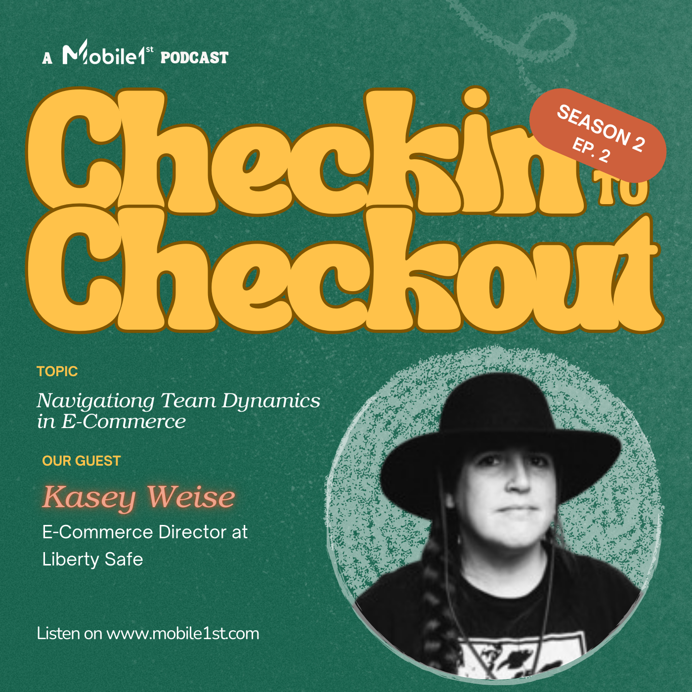
Navigating Team Dynamics in E-commerce with Kasey Weise
Listen to the second episode of season two of Checkin to Checkout.