
In December 2011, Google first clearly recognized that mobile is a juggernaut, posed to steamroll over all other media on its way to worldwide dominance. That was the fateful month in which Google launched its Google-Bot-Mobile to crawl the Internet and assess websites’ performance on mobile.
Now, five years later, comes one more proof that mobile truly rules the world. In 2016, the majority of Google’s net global ad revenues (59.5%) will come from mobile, a stunning leap from 45.8% in 2015.
Yes, you, I, and Google know that mobile makes the world go round. That leaves us with the question: Is your website primed for mobile traffic? How does it perform in organic search rankings on mobile, and what precisely do you need to do to ensure your mobile SEO earns that all-too-crucial page-one ranking (which grabs 80% of users’ clicks)?
#1 Got to go mobile
Google is watching. Their bots are crawling and inspecting. Their algorithms are judging. Like impervious gods, they are dictating the fate of your business – elevating or lowering your website’s ranking depending on its mobile performance.
The very first thing you must do to enhance your mobile search engine optimization is make sure your website is mobile accessible. Currently there are three basic options for providing a mobile-optimized site:
- Responsive web design (RWD)
- Serving dynamic content dependent on device
- Mobile specific URLs (a distinct mobile website)
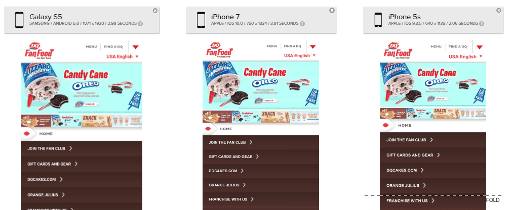
Dairy Queen’s website provides an unreadable, condensed view of its desktop display to its mobile visitors.
All three options are judged satisfactory by Google in terms of ranking signals, however they specifically endorse RWD. Responsive design employs the same URL, coding and content, but adjusts it to meet the size requirement and functionality of the user’s device. By delivering one website with unified code, RWD delivers additional benefits:
- Efficiently uses resources
- Provides similar experiences across PC, laptop, tablet and smartphone
- Maintains unified site authority (an important ranking signal for Google)
- Loads pages quicker without redirects
The other two options, as Moz explains, offer the advantage of enabling your team to exploit to the utmost the potentialities of mobile delivery.
#2 Mobile SEO: Speed
Beyond, the mere provision of a mobile accessible site, Google applies a higher and harsher SEO standard they term “mobile friendliness.” Luckily, this ranking signal is relatively transparent, and Google offers a test so you can see precisely how your site is currently being assessed.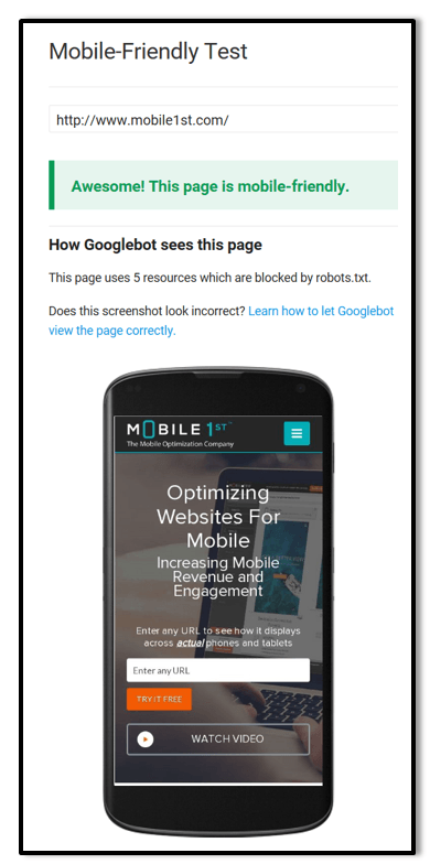
A critical factor in Google’s mobile friendliness is your website’s load speed. No factor is more prominent and damaging in the average web surfer’s experience than the irritating wait for a website to load. The ideal standard is three seconds, beyond which your customers will start fleeing your website and failing to convert.
Google, however, proposes a mere one-second loading time as the proper goal for websites on mobile, a target they help to meet with their AMP project and extensive guidance. To learn precisely how fast your web pages load across a range of market-leading phones and tablets, be sure to test your site on Mobilizer.
#3 Legibility as a mobile-friendly factor?
A second critical aspect that Google factored into its mobile SEO rankings is font size. Legibility is of course extremely important to users, but as shown above in the screenshots of Dairy Queen, too many websites simply fail to adjust to the miniature mobile screen. Website visitors, along with Google’s ranking algorithm, disdain squinting or zooming in on text so it can be read.
“Sites that force users to horizontally scroll fail the Google Mobile-Friendly Test, which may negatively impact their search rankings.”Google
Google advises using a base font size of 16 pixels, with any other font sizes (such as small and large) defined proportionality to that baseline. The vertical space between lines should be set at 1.2em. Finally, based on best design principles, Google recommends strictly limiting the number of fonts used and their typographic scale. A web page that is too busy with multiple fonts and sizes is simply hard to read and navigate.
(Consult here for additional typographical suggestions from Google, and for fully WC3 accessible resources on typefaces, visit here.)
#4 Touch-tap targets
Everyone knows humans are a flawed species. Our history has been defined by inventing tools and techniques to make up for our physical deficiencies, whether it’s our ability to withstand cold weather, fend off bacterial infections, or just accurately place our stubby fingers on the touch targets of a mobile screen.

Google reacts to this frustrating aspect of human eye-hand coordination by mandating that all touch targets – all buttons and links – need to be spaced far apart and large enough to be tapped without hitting another. Designers, pressed for space, can’t afford to scrimp by cramming buttons into too close proximity.
#5 Avoid full-screen popups to ensure mobile SEO
A major hindrance to a great user experience and indeed damaging to conversions are “interstitials,” that is, full-screen popups that either completely or in part cover the information of a web page. Remarkably common, most every user despises these full-page popups, which are all too plentiful on phones promoting a company’s app, mailing list signups, or advertisements. In the most absurd cases, the interstitial is designed to make it next to impossible to dismiss, typically leading to ultimatum of sorts—sign up for our offer or depart from this site.
Google will definitely penalize your mobile SEO for this kind of mobile-unfriendly behavior.
#6 Eschew code, content and videos that refuse to perform
Did you ever stumble upon content, such as videos, that simply isn’t accessible on your smartphone? Most prominent in this category is content that requires Flash or other players that are not widely supported on mobile devices.
When visitors comes across a website with content that fails to display on mobile, they typically see an error message or simply a blank black box. Needless to say, this offers website visitors an exceedingly poor experience, and such unplayable content lowers of your website’s ranking.
Mobile1st offers mobile optimization services to increase your mobile website’s revenue/conversion by decreasing your shopping cart abandonment rate, reducing your page load speed, improving mobile UX and SEO, analyzing your mobile analytics, and more. Our team of mobile experts analyzes and improves your website across 35+ factors, A/B tests ideas, and can even (optionally) implement the design/code changes.
Contact Mobile1st Experts Now!
Google recommends implementing HTML5 standard tags to include videos or animations, instead of employing a proprietary video player or providing content in unsupported formats.
Since Google’s April 21, 2015 update to its search engine algorithm (AKA “mobilegeddon”), Google has put its money where its mouth is. Your website must be “mobile friendly” or pay the price in lowered organic ranking. Of course, Google has a vested interest in the performance of the web on mobile. They strive to enhance user experience so users stick to the web and don’t depart for apps, where Google’s AdWords and its revenues can’t follow.
Yes, marketing managers and website developers are right to focus on their mobile rankings and how mobile SEO can expand traffic and elevate conversions. Fortunately, the pathway to enhanced “mobile friendliness” and improved search engine rankings are a matter of clearly defined best practices, not a matter of trial and error or, worse, intuition. The six steps highlighted here, along with other tactics to enhance your website’s mobile UX, can offer a powerful boost to your ecommerce success.
- Google’s AMP: Enemy or Ally to Your Mobile Friendly Website? - January 29, 2018
- Mobile Marketing: Optimize the Mobile Customer Journey - January 29, 2018
- Mobile Load Time: Increasing Mobile Page Speed to Improve Mobile Conversion - January 22, 2018