
Last Updated January 25, 2018
We’ve thoroughly reviewed the leading solutions for testing mobile websites:
Read below to see our full assessments, but we must warn you: Most of these mobile testing tools will deliver false and misleading results that ultimately could cost you customers.
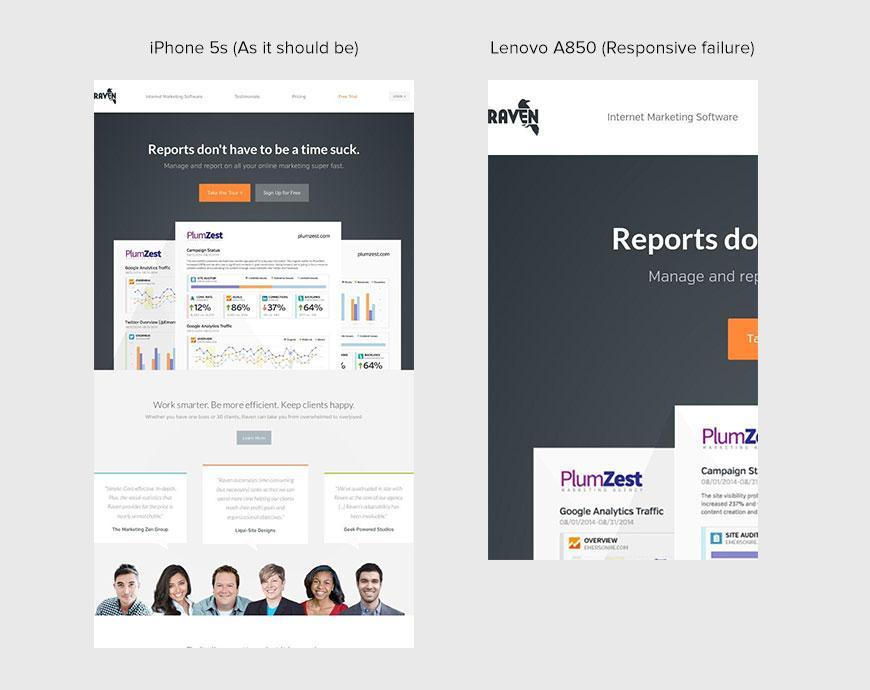
If you’re not familiar with Raven Tools, we recommend you check them out. Their product is great and their site looks great on almost all mobile devices. As you see, on the Lenovo A850, one of the more prolific smartphones in Asia, its responsive breakpoint is creating literally half the experience they’re shooting for. There’s no question Raven is targeting a global market. Based on how well their site responds on all other devices we tested, they clearly know how to create a responsive website. So, in Raven Tool’s case, it’s just an awareness issue.
The challenge is how to quickly check a website design against the market share of mobile devices. This is especially applicable for products engaging a global market. This problem is not isolated to just product builders: designers, developers and testers. It affects marketers, executives and anyone in an organization with sales and brand responsibility.
Responsive design practices are trying to combat poor mobile experiences. However, after 30K+ websites being reviewed for mobile compatibility on actual real devices, we’ve found that fully responsive design is the exception. 7 out of 10 websites have at least one significant problem across 14 of the most popular phones and tablets. As you would imagine, this is especially true for sites that perform frequent content updates.
Key Variables
Responsive website design is definitely getting attention, so why is this problem plaguing so many companies? There are several scenarios/practices that introduce the shortcomings. First let’s cover what variables are important when testing mobile experiences.
Screen size – The dimensions of the screen need to be matched to represent the target device accurately.
User agent – When a browser connects to a website, it passes the User Agent in the HTTP header. Each browser has a unique User Agent. The web server can use this information to serve different web pages to different web browsers and different operating systems. For example, a website could send mobile pages to mobile browsers, modern pages to modern browsers, and an “Time to upgrade your Browser” message to older browsers.
Browser rendering engine – This is the code the browser uses to interpret the HTML/CSS and create what we see in the browser.
Options for Mobile Testing
Mobile website testing tools fall primarily into three categories:
The following is an explanation of each category, example solutions, and most importantly actual results from the tools and how they address (or don’t address) the important variables.
1. Embedded iframes
Embedded iframe based tools use a HTML element known as an <iframe>. The iframe element represents a nested browsing context, and can be sized to any size. Below is the code to create an iframe the size of an iPhone 5 followed by a screenshot of what it actually looks like in the browser.
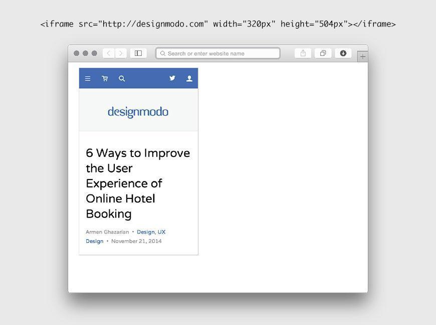
Responsive testing tools using iframes set the src element to the website to be tested and alter the width and height to match the size of the target device.With the technical explanation out of the way, here are a few of the most popular iframe based responsive design testers on the web:
Responsinator
Responsive Web Design Testing Tool
Designmodo Responsive Design Test
Responsive Design Checker
Each tool uses the same basic embedded iframe approach with different UIs around it. Tools in this category will yield the same results for our mobile testing variables:
- Screen size – As discussed, this is addressed by setting the iframe’s width and height. So the size of the website should be accurate.
- User agent – An iframe’s User Agent will always be the same as the browser hosting the iframe. So for mobile testing, the User Agent will always be incorrect using this category of test tools. We’ll revisit this shortly to highlight how this causes problems.
- Browser rendering engine – Just as with the User Agent, the iframe’s browser rendering engine will always be the same as the browser hosting the iframe. Although browsers are becoming more and more standardized every day, the gap is still fairly significant. Our first example highlights this issue.
We’ll use Responsinator as our example tool, but all of these tools would yield the same results.
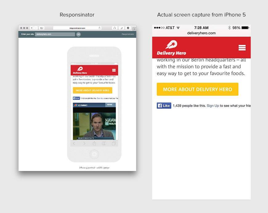
Tool: Responsinator
URL: http://www.deliveryhero.com
You’ll see there’s something missing- the video. Evidently the video player used on this website is not supported on the iPhone. So this detail would be overlooked if an iframe based tester were to be used to examine the website.
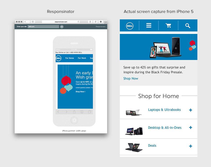
Tool: Responsinator
URL: http://www.dell.com
Responsinator clearly is showing a completely different experience than what’s actually rendered on the phone. In this case, this is occurring because Dell’s site is still altering it’s content based on the detection of the User Agent. Since you cannot alter an iframe’s User Agent, the site is not the mobile version. This highlights a critical point with testing tools targeting mobile websites. One could argue that since Dell’s site isn’t a responsive site, the responsive tool is pointing that out appropriately. However, we’ve learned through feedback of our 150K user base, that a significant portion of people using tools like this, believe what they see on the screen is how it looks on the device.
Tool: Responsinator
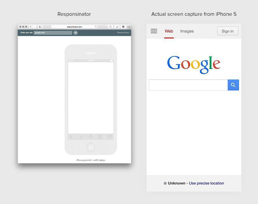
URL: http://www.google.com
You’re not seeing things. Responsinator is blank. This is caused by something many large companies do and are increasingly doing to prevent their page from being embedded in an iframe. The motivation for making this change is to increase their website security. They accomplish this by adding X-Frame-Options: SAMEORIGIN or similar setting to their HTTP headers. So a code change would have to occur before being able to use an iframe based tool like Responsinator.
2. Mobile Emulators
Emulator based tools use a desktop application, typically supplied by the OS manufacturer, which emulates target device(s). For example, Apple supplies a mobile emulator named iOS Simulator. Which brings up the question, “What’s the difference between an emulator and simulator?” The answer is simple, nothing. In fact, the terms emulator and simulator are often used in contexts that stretch their meaning. The iPhone4Simulator website is actually just another example of an iframe based tools discussed in the previous section.
So to clarify, for purposes of this writing, when we refer to something as a mobile emulator or simulator, it means a separate standalone application created to emulate the mobile device on a desktop system.
Website testing tools that use mobile emulators should be superior to iframe-based tools. They are capable of not only sizing the screen appropriately, but also supplying the correct User Agent. Let’s go back to the iPhone4Simulator site to show the difference. Since iPhone4Simulator is an iframe based tool, when shows a website, it’s using the user agent of the browser. In my case it’s the following:
Mozilla/5.0 (Macintosh; Intel Mac OS X 10_10_1) AppleWebKit/537.36 (KHTML, like Gecko) Chrome/38.0.2125.122 Safari/537.36
However, the iPhone 4 user agent is actually:
Mozilla/5.0 (iPhone; U; CPU iPhone OS 4_2_1 like Mac OS X; en-us) AppleWebKit/533.17.9 (KHTML, like Gecko) Version/5.0.2 Mobile/8C148 Safari/6533.18.5
So if the User Agent is correct, and the size is correct, what are the drawbacks of these types of tools? To answer this, we’ll again use examples to illustrate the potential pitfalls.
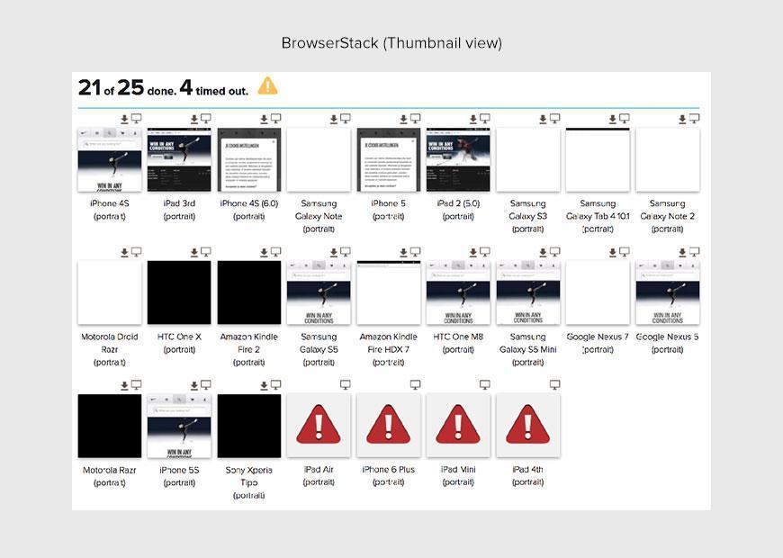
Tool: BrowserStack
URL: http://www.nike.com
Notes: For BrowserStack, we used their Screenshots product to capture the screenshots of the websites.
Details:
This example highlights some deficiencies using this tool.
- Only 8 of 25 results are usable
- Test took over 12 minutes
- 2 of the results are in another language. This implies the OS language was changed at some point on the emulator, but doesn’t get reset after use.
- Images are low quality, so examining for details with retina images or using for presentations would be problematic.
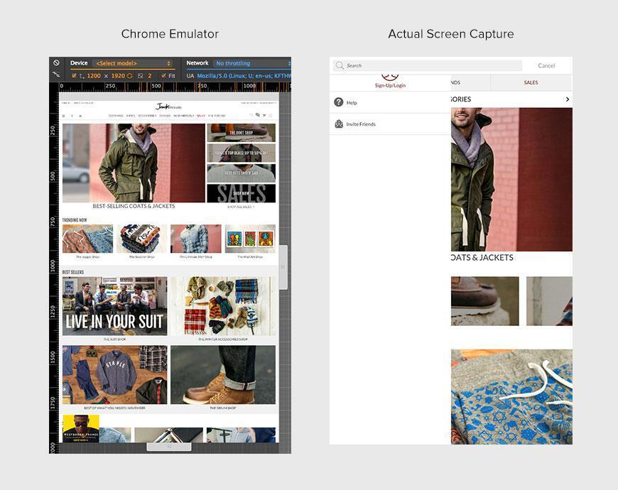
Tool: Chrome Emulator
URL: http://www.jackthreads.com
Results: Using the Amazon Kindle Fire HDX 7 for both
Details: The results are completely different between the emulator and the actual screen capture from the device.
3. Real Devices
Due to the growing importance of people’s mobile experience in eCommerce, nothing can be left to chance. Therefore, solutions offered that use real devices are growing in popularity. Real devices are still the only way to guarantee real results.
Here are a some of the existing solutions out there that employ real devices:
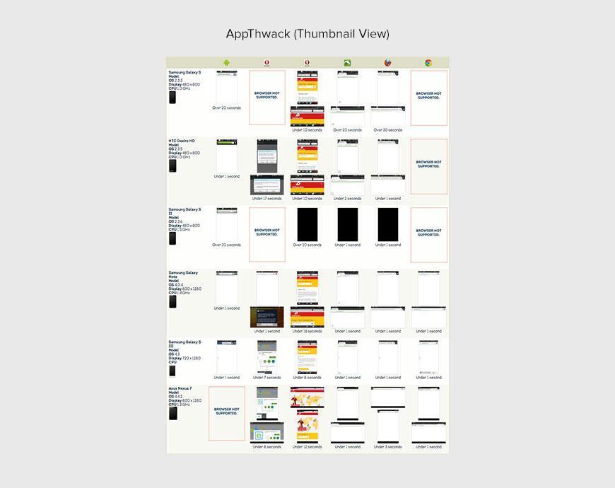
Tool: AppThwack
URL: http://www.deliveryhero.com
Details:
This example highlights some challenges using this tool.
- No iOS devices supported
- Only 5 of 30 images returned something resembling the website being tested
- Often the results were either blank white or black screens
- Test took over 7 minutes, which is a long time to wait for such sparse results.
- 2 of the results are apparently a screenshot of another application in the marketplace.
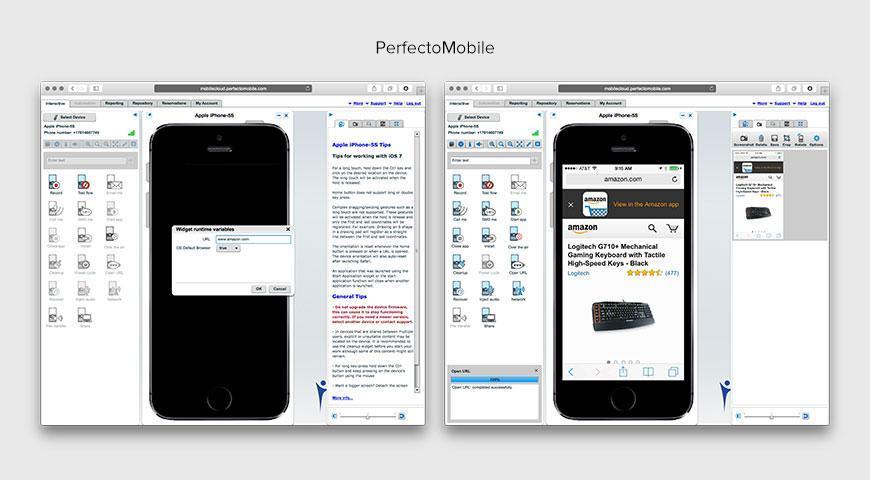
Tool: PerfectoMobile
URL: http://www.amazon.com
Note: PerfectoMobile is more targeted toward test automation and application testing.
Details:
- Without writing some complicated automation scripts, the process shown above would have to be repeated for each device to be tested (approximately 5 minutes per device).
- The web interface is also flash based, which for some, is a non-starter.
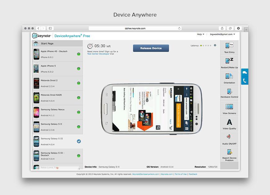
Tool: Keynote Device Anywhere
URL: http://www.amazon.com
Note: Similar to PerfectoMobile, Device Anywhere is also more targeted toward test automation and application testing.
Details:
- One device at a time, so viewing a website on multiple devices will be arduous.
- After using an iPhone 4 device where Safari crashed after entering any URL, we moved on to the Samsumg Galaxy S III.
- Very laggy experience using the keyboard to enter a URL.
- Orientation button flipped the device image but apparently didn’t actually affect the orientation of the device. This may work on other devices, but we were unable to get it to work.
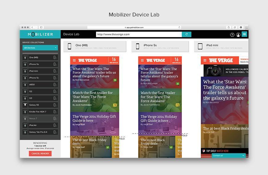
Tool: Mobilizer
URL: https://mobile1st.com/
Mobilizer is the only tool that shows you real results from real devices in seconds. In less than one minute, websites are captured from real devices and brought to your browser. You can capture and share the results with colleagues and clients.
- Can you trust Chrome’s Emulator for your responsive design testing? - January 26, 2018
- Mobile Emulators – The Very Real, Unhappy Truth - January 25, 2018
- 8 Reasons Why You Need Responsive Design Testing - January 17, 2018